


Your Website Should Not Make Customers Work
A Brooklyn homeowner lands on a contractor’s website after searching from a phone. They like the project photos, but cannot find a phone number without scrolling, the quote form asks for too much information, and the service area is unclear. Within seconds, they return to Google and call a competitor.
That is exactly what website usability testing is designed to uncover. It shows where real visitors hesitate, get confused, abandon a task, or lose confidence in your business. For a local service company, retailer, restaurant, professional practice, or online store, those small points of friction can quietly cost qualified leads and sales every day.
A polished website is not automatically an effective one. Strong colors, professional photography, and modern animations may create a good first impression, but visitors still need to complete practical tasks quickly. They need to understand what you offer, why they should trust you, how much to expect, and what to do next.
What Website Usability Testing Reveals Before Visitors Leave
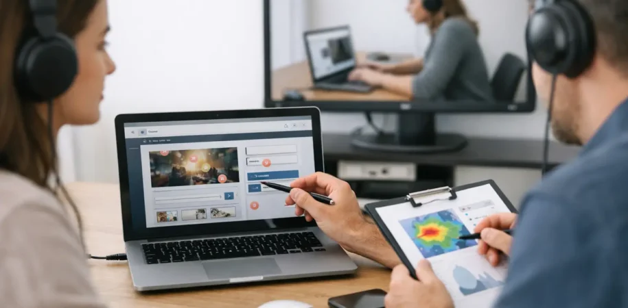
Usability testing is the process of watching representative users attempt realistic actions on your website. Instead of asking whether they “like” the design, you give them a goal: request an estimate, find a specific product, schedule an appointment, compare services, or locate your business hours.
Their behavior is more valuable than their opinion alone. A visitor may say a website looks great while still failing to find the contact page. They may compliment an online store while struggling to choose the right product variation or understand shipping costs. When several people encounter the same issue, it is usually not a user problem. It is a website problem.
For business owners, the goal is not to make every visitor stay longer. The goal is to help the right visitor make a confident next move. That could mean calling your office, submitting a lead form, booking a consultation, adding an item to the cart, or visiting your physical location.
The most common friction points
Many underperforming websites do not need a complete rebuild. They need a closer look at where the customer journey breaks down. Common issues include navigation labels that make sense internally but not to customers, homepage messaging that does not clearly explain the business, forms with unnecessary fields, and mobile buttons that are difficult to tap.
For e-commerce businesses, usability problems often appear near the purchase decision. Product descriptions may not answer key questions. Size, color, delivery timing, returns, or pickup options may be hard to find. A shopper may reach checkout only to discover unexpected costs or a confusing account-creation requirement.
Local businesses face a different but equally important challenge: visitors need immediate reassurance. A prospective client looking for a Queens accountant or Long Island roofing company wants to know whether you serve their area, whether you handle their need, and how quickly they can reach someone. If those answers are buried, the visitor may assume your business is not the right fit.
Why mobile testing deserves special attention
Most business owners review their own website from a desktop or laptop. Their customers often do not. They are searching from a phone in a car, at a job site, between meetings, or while standing in a store comparing options.
On mobile, there is less room for distractions and less patience for unclear choices. A menu can take over the screen, a chat popup can block the call button, and a wide pricing table can become unreadable. A form that feels reasonable on a desktop can feel exhausting on a phone.
Responsive design is the foundation, but usability goes further. Test whether a person can call, request service, search products, use filters, and complete checkout with one hand and limited attention. If the answer is no, your site is leaving revenue on the table.
A Practical Website Usability Testing Process
The best testing process is focused. You do not need to ask people to browse aimlessly for an hour or collect a stack of vague feedback. Start with the business actions that matter most and learn whether visitors can complete them without coaching.
Start with clear business goals
Before testing, decide what success looks like for your website. A law firm may prioritize consultation requests. A restaurant may need online reservations and catering inquiries. A Shopify store may focus on product discovery, cart completion, and repeat purchases. A WordPress site for a home service provider may need more calls and estimate requests.
Choose two to four high-value visitor tasks connected to those goals. For example, you might ask a tester to find emergency plumbing service, determine whether you serve their neighborhood, and request an estimate. For an online store, ask them to find a specific product, compare two options, and place an item in the cart.
The task should sound like a real customer situation, not an instruction manual. “You need a birthday gift under $75 that can arrive this week” produces more useful behavior than “Click on the Gifts category.”
Test with people who resemble your customers
Five thoughtful usability sessions can expose patterns that analytics alone cannot explain. The right number depends on your audience and website complexity, but small rounds of testing are often more useful than waiting for a large study.
A B2B software startup should not rely only on feedback from friends who work in design. A local dental practice should include patients who are comfortable with technology and those who are not. An online retailer should test with shoppers who match its real buyer profile, including people browsing on mobile devices.
You can conduct moderated sessions over video, in person, or through remote testing platforms. In a moderated session, ask the participant to think out loud. Hearing “I expected this to be under Services” or “I do not know what happens after I submit this form” can point directly to a conversion barrier.
Do not explain the interface while the person is testing it. It is tempting to say, “The button is at the top,” especially when you know the website well. But if a visitor needs help, the design has already provided an answer.
Record behavior, not just comments
Pay attention to where people pause, backtrack, reread copy, open multiple tabs, or abandon a form. These moments often reveal more than a final rating. A participant might finish a task eventually, but take a confusing route that a less motivated prospect would never tolerate.
Look for repeated patterns across sessions. If one person misses a button, that may be personal preference. If four people overlook the same button, its placement, label, color, or surrounding content deserves review.
Useful findings are specific. “Navigation is bad” is too broad to act on. “Visitors looking for commercial services do not recognize that ‘Solutions’ contains the commercial service page” gives your web team a clear starting point.
Prioritize fixes by business impact
Not every issue has equal value. A typo in a blog post matters less than a checkout error, hidden phone number, broken scheduling flow, or confusing service page that affects lead quality. Prioritize changes based on how strongly they affect revenue, trust, and task completion.
Quick wins might include making the primary call to action more visible, simplifying a contact form, clarifying a service label, or adding delivery details to product pages. Larger improvements may involve reorganizing navigation, rebuilding a checkout experience, improving site speed, or creating clearer landing pages for high-intent search traffic.
This is where usability and SEO support each other. Search optimization can bring more qualified people to your website, but a confusing experience wastes that opportunity. Clear page structure, helpful content, fast loading, and relevant calls to action give visitors a reason to stay and a path to convert.
Use Analytics as a Clue, Not the Final Answer
Analytics can show where visitors exit, which device types convert poorly, and whether a key page receives traffic without generating leads. Heatmaps and session recordings can also reveal unexpected behavior, such as visitors repeatedly clicking non-clickable elements.
But numbers rarely explain motivation on their own. A high exit rate might mean the page is weak, or it might mean visitors found the phone number they needed and called. A low form completion rate could be caused by technical errors, unclear value, privacy concerns, or questions the form does not answer.
Combine analytics with direct observation. If data shows mobile visitors leaving your product pages, usability sessions can show whether product images are too small, filters are difficult to use, or important purchasing information is hidden below the fold. The combination leads to better decisions than either method by itself.
Testing Is Most Valuable Before and After a Redesign
Website usability testing is especially valuable before a redesign because it prevents businesses from rebuilding the wrong thing. If an existing site has poor results, the issue may not be the entire visual identity. It may be unclear messaging, a weak conversion path, slow mobile performance, or missing trust signals.
Testing early lets you make decisions based on customer behavior before design and development resources are committed. During a new WordPress, Shopify, or custom website project, simple prototype testing can validate page structure and calls to action before every detail is finalized.
Testing after launch matters too. A launch is not the finish line for a growth-focused website. New content, seasonal promotions, product changes, search campaigns, and platform updates can all create new friction. Ongoing testing helps ensure that your website keeps supporting the business as it changes.
At SHAH-TECH, we view websites as active business assets, not static brochures. A result-oriented website should be easy to understand, fast to use, professionally designed, and built around the actions that create real business value.
Your customers will not send a message to explain why they gave up. Most will simply choose another option. Give them a website that answers their questions, respects their time, and makes the next step feel obvious.